By: Theresa Christine Johnson at The Dieline
Funky Buddha Brewery had a big problem. People loved their beer.
OK, so that doesn’t sound like much of a problem; we get that. Folks enjoyed cracking open a can of their Floridian hefeweizen after a long workday or sitting on a patio and drinking their Hop Gun IPA. The issue, however, was no one was aware those were brewed by Funky Buddha—all anyone knew was they liked the beer.
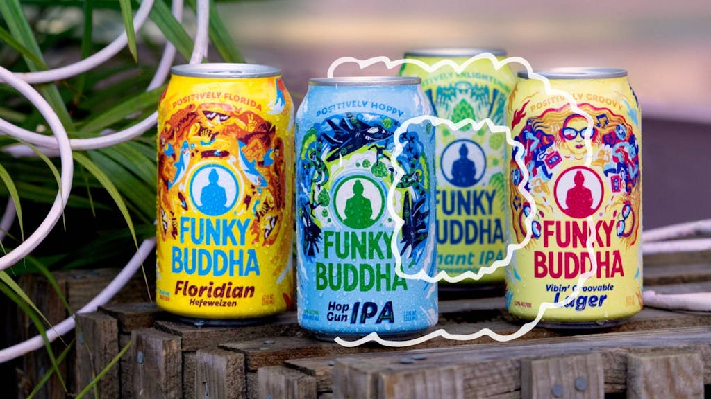
“From a shelf perspective, the billboarding on both the cans and the six-packs contributed to the busyness of the space,” said Derek Springston. Derek is the chief creative officer and partner at Moxie Sozo, the agency which led the redesign while collaborating with Funky Buddha’s internal team. “Our objective was to create a system that didn’t lose the brand’s personality but was much more effective in communicating that brand recognition.”
“We wanted to retain that unique personality per beer, which every beer brand wants to do,” added Charles Bloom, creative director and partner at Moxie Sozo. “We wanted to find ways to bring in that consistency without being too homogenous, boring, or formulaic.”
Funky Buddha has multiple series, including their core line, limited releases, and a hard seltzer. But what makes them so different from each other is what unifies them. With this in mind, Moxie Sozo evolved the existing logo mark. Doing that helped radiate the beer’s personality on the can—as if everything were flowing from or into the brand itself.
